images
last updated. may 04
I think my graphic skills have improved since making some of the older things on this page. I'm always improving a little as I go. In any case, I've finally added some non-Xena stuff ;)
Many of the graphics I've created have been for fan sites, conventions and memorabilia, either because of my personal interest or because of unique opportunities to have my work seen. But I'm certainly not limited to creating fan-related work. I can draw, but I'm not really an on-paper artist. I am quite capable, however, at using existing images to create what I want. And I'm pretty good at creating original art on the computer as well. I've finally added some non-fan work, but there's more fan than not. That is just what I spend most of my time on :)
If you're interested in having me do some work for you, please don't hesitate in contacting me. My prices are very reasonable.
Here are a few examples of my image manipulation and design skills:
Here is a detail of the finished envelope:
[click to view a larger image]
The business card is very similar to the graphics above.
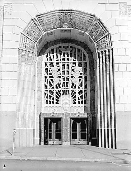
Here's the Marine building photo. I edited out the parking meter:

[click to view a larger image]
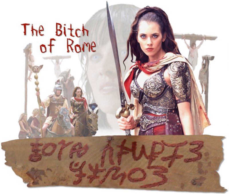
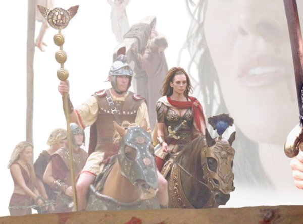
livia
This was made for a friend who was a big fan of this character. The design is mainly my idea, but I discussed it with her and she supplied the quote that graced the back of the T-shirt ("Time to put you out of my misery").
Sometimes particular characters of a TV program don't end up getting the focus that a contingent of fans want. If merchandise doesn't appear featuring this character, fan-made products are often the result (regardless of intellectual property laws). Before having it made clear to me that I wouldn't be able to have this graphic appear on any kind of merchandise, I'd hoped to be able to make a T-shirt, mousepad, journal, etc, with the graphic. I still did manage to get one run of products printed (hehe), and they turned out pretty damn good. Although I won't be able to follow through on my original plans, I am still happy with how the graphic turned out. And since my friend did get the one T-shirt made, all the work was worth it ;)
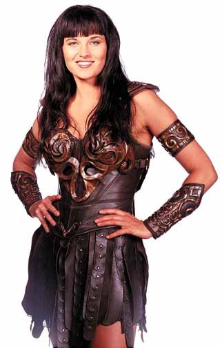
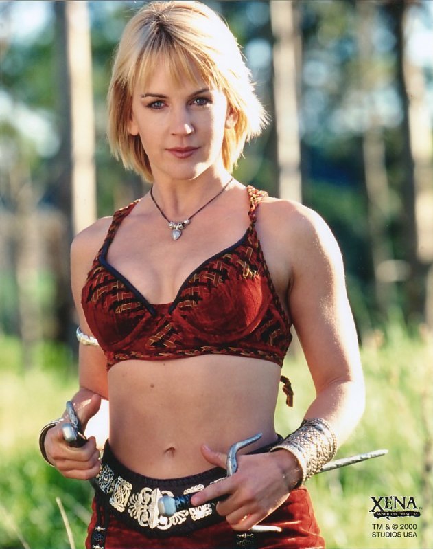
I needed a nice crisp photo for the main figure, but I had to use screencaps from Xena episodes for everything else. Luckily, I was able to use good quality screengrabs, mainly courtesy of Mike's Images (and with his kind permission). I got a couple others from sites that don't seem to exist anymore.
The finished graphic, saved as a .png file, looks much better than these jpegs. Unfortunately, I'm limited to file formats that the Net supports.
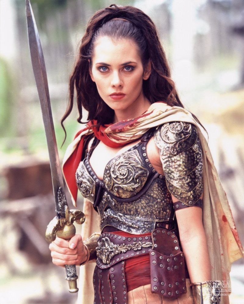
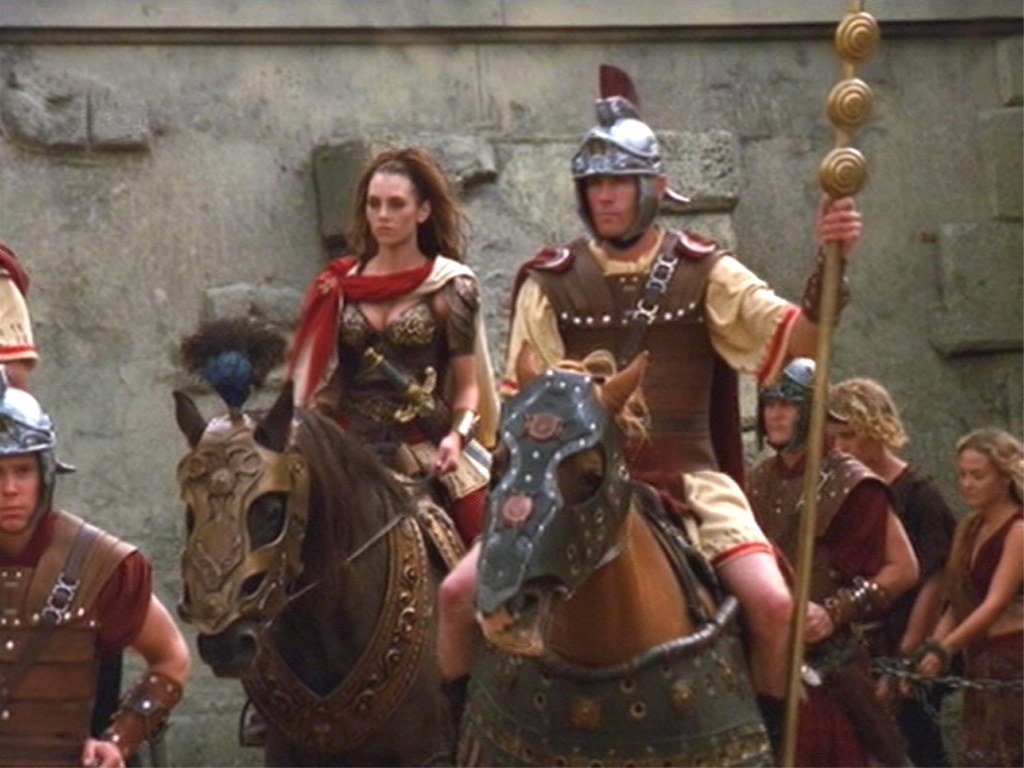
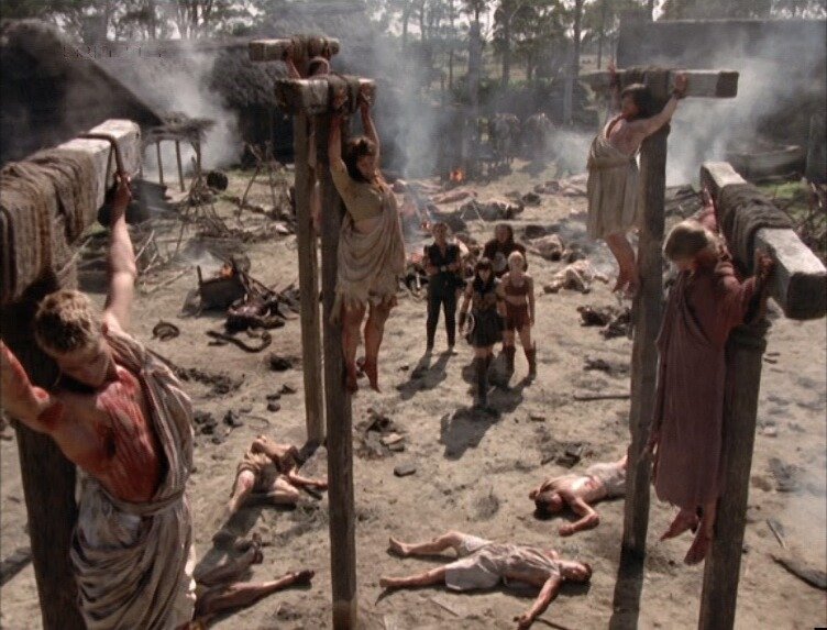
This was the finished graphic:
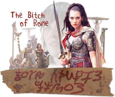
[click to view a larger image]
These are some of the images I used:
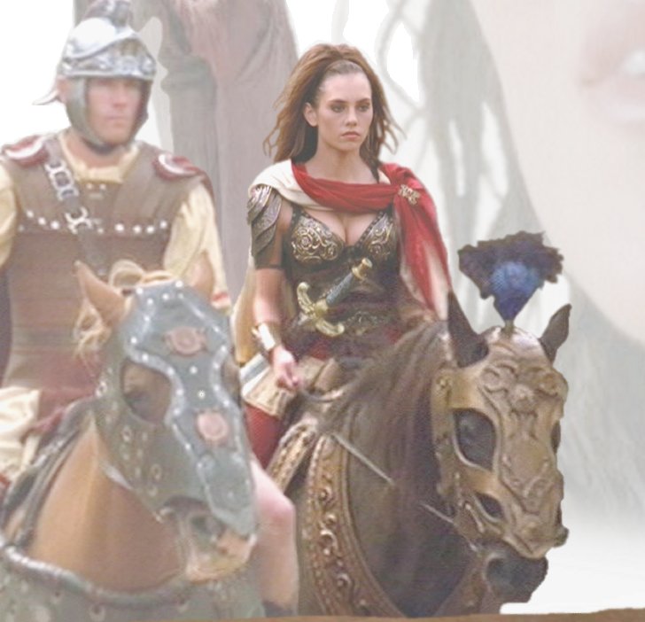
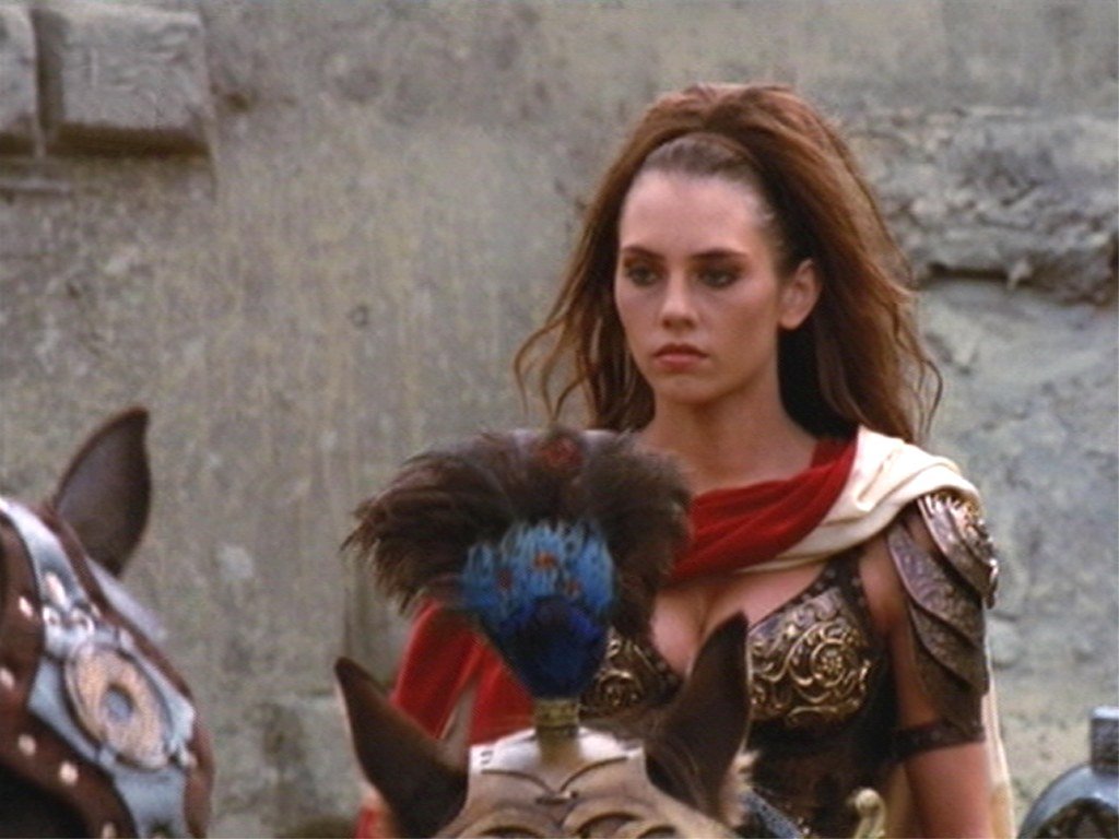
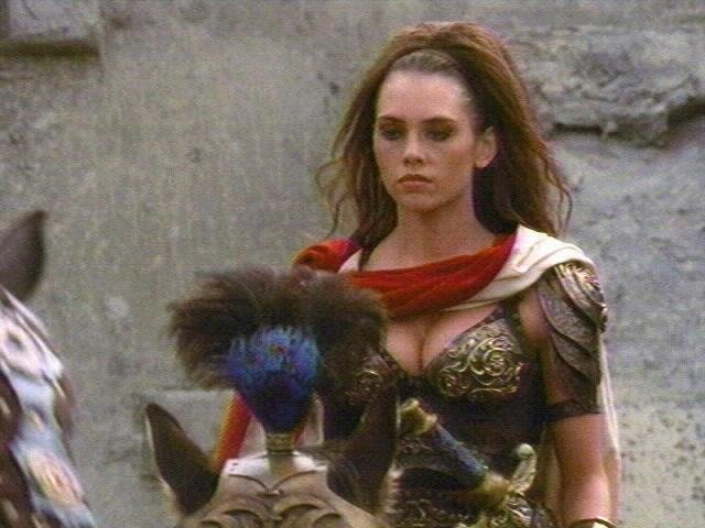
You may or may not have noticed that Livia on horseback stands out more than her companions:
I accomplished this in two ways. One very simple method was to lighten the centurions and slaves so that Livia would look much more robust in comparison (despite the fact that the roman soldier on horseback beside her is actually nearer to 'us'). The other method was a little bit trickier and required some luck. I managed to find two scans of Livia from the same scene that were much closer. Unfortunately, the horse's plume was blocking some crucial parts, so I had to mix and match parts from the two scans. With a bit of wrangling I managed to piece a much clearer image of Livia's upper torso over the original establishment screengrab. Thus, if you look closely at the second detail you will see that the top half of Livia is crisper and more distinct than the lower half (which is why this detail looks so much better than the original establishment screengrab above). This way I was able to have the fuller shot of Livia - complete with Roman soldiers and conquered slaves - but have her be the most clear and eye-catching part of the ensemble. I still would have preferred finding a picture of her looking a little more fierce, but Livia looked glum during this entire scene. What can you do? But I shouldn't complain. I was very fortunate in getting this little drama to come together.
What you can also see in this detail is how I patched in an actual photo of a bronze Roman eagle on top of the standard that the centurion is holding (from which the top was cropped off in the screengrab).
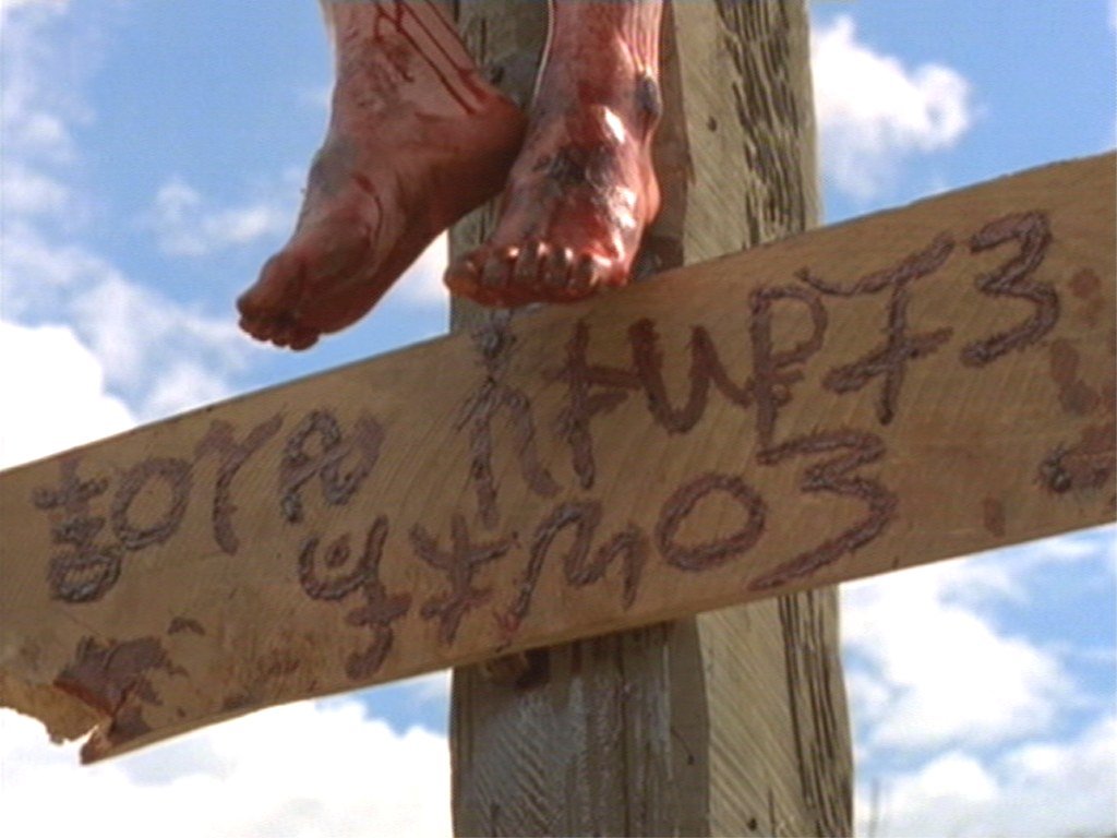
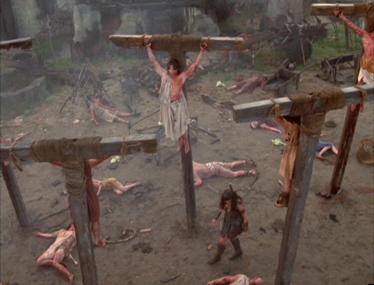
As for the poor crucified people (it's such a happy graphic ;), I never did really find very good scans of them, which is why they were used primarily in the background. But here's a couple of the scans I used for them:
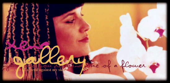
gallery intro
Just experimenting with color and fonts
gallery intro graphic:

[click to view a larger image]
logo
I needed a distinctive logo for my own Xena: Warrior Princess site and couldn't find an existing image with the characters in the pose that I wanted, so I used several different photos to create the effect I was looking for - Xena and Gabrielle coolly gazing at the viewer.
This was the end result:
[click to view a larger image]
These were the images I used:
Notice that I 'removed' the sun shining on Gabrielle's face, hair and neck.
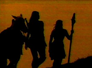
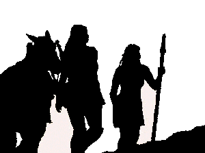
poster
I was helping with a Xenafest in Vancouver in 1998 and we needed a poster to promote the event. Because we were going to be promoting our convention - including with the media, but were a group of fans holding an unofficial event (which was not-for-profit), we decided not to use the faces of the stars. I had made previous promotional materials using the silhouettes of the two main characters, and I thought a variation on that would be effective again. But this time I wanted something more dramatic. I decided to make a silhouette of the two main characters walking off into the sunset. Hunting around on the 'Net I found a scanned image from the show that was perfect, albeit rather muddy. I cleaned it up, changed the look of one silhouette to reflect a change in costume, and then expanded it and used a color gradient to give the sunset effect (although, the characters are in fact walking 'out' of the sunset ;). This resulted in the simple yet eye-catching image of Xena and Gabrielle trekking to the fest. We ended up using the graphic for shirts and posters, both of which we sold at the festival in June of 1999. I guess the image was effective, because it ended up being 'borrowed' by someone else on the web to use as a banner (until I sent them a couple of e-mails ;).
This is the basic design:
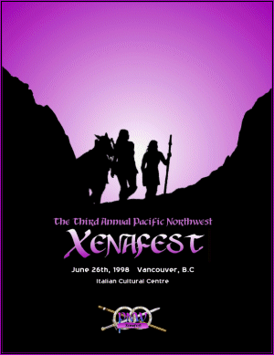
[click to view a larger image]
The second image is a mid-stage graphic with small changes made to Gabrielle's staff and clothing:
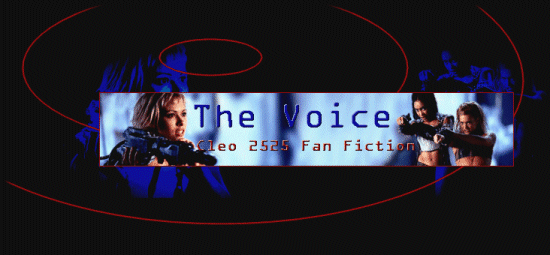
something new
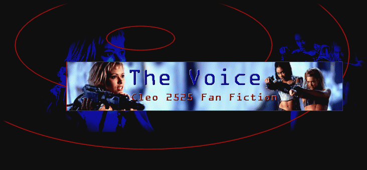
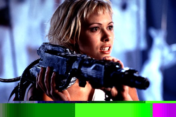
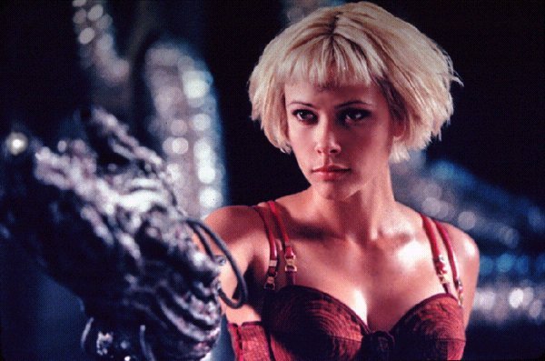
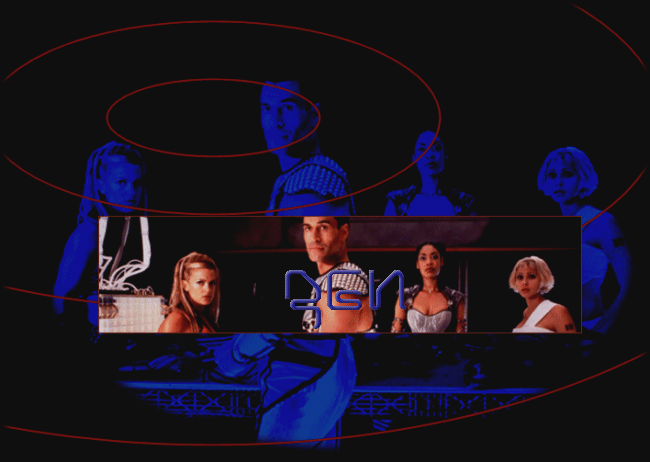
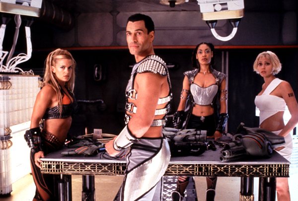
I wanted to get the chance to make some futuristic graphics a few years ago, so I started a site for the science fiction show Cleopatra 2525 (although I never did maintain it). As the television series was brand new at the time, only a small amount of promotional images were available to play with - but I came up with these graphics for various pages.
Main Page Graphic:
[click to view a larger image]
These were the images I used:
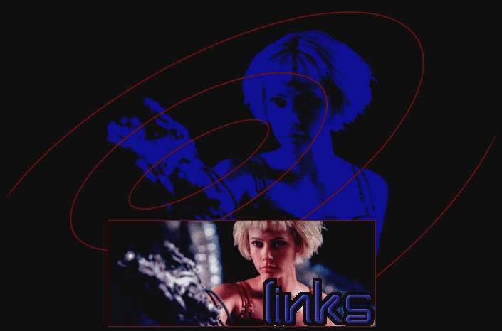
Links Page Graphic:
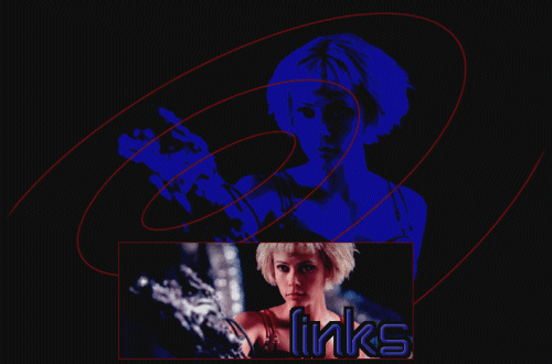
[click to view a larger image]
This was the image I used:
General Stories Page Graphic:
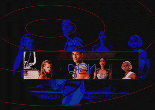
[click to view a larger image]
This was the image I used:
more coming soon...